SkyHigh UX: Booking process made simple
MY ROLE
Product designer
The TL;DR
THE TIMELINE
5 months
THE PRODUCT
As a result of my journey with UXDI I designed the user experience of booking a flight for a fictitious airline's website.
THE PROBLEM
The goal of this project was to solve the current usability issues that are present in most common airline websites on the market.
THE OUTCOMES
From a business perspective, the airline website has to reach global conversion rate for airline companies.
From the user point of view, the interaction has to be calm, easy to understand and not overwhelming.
Understanding the problem
The first thing I did was to perform research to obtain a deeper understanding of airline websites and the existing conventions surrounding the booking of flights for users.
During my study, I used the following research methods: competitive benchmarking, online survey and usability testing.
COMPETITIVE BENCHMARKING
What others are doing
This process allowed me to understand the competitive landscape, identifying effective practices, pain points, and current standards.
Main takeaways:
Most websites used standard conventions for search, selection, and booking stages. While the search process was generally easy to follow, the flight selection and booking stages were more complex.
Features that improved user experience included uncluttered pages, prominent search boxes, progress bars, and rapid search result updates.
Significant issues included excessive ads, unclear fare information, and off-page calendar overviews.


*See the complete benchmark here
SURVEY
Quantifying user decisions
In this short quantitative research, I aimed to identify users' main purposes when visiting an airline website and test my assumptions:
Users use travel aggregators to search for flights.
Users prefer to book flights on the airline's website.


27 participants responded with these were the insights:
The main reasons for visiting an airline website were to check-in or book a flight.
My assumptions were confirmed:
Nearly 60% of participants use travel aggregators to search for flights.
74% prefer booking flights on the airline's website.
USABILITY TESTING
Gaining first-hand insights
I conducted two usability tests to acquire deeper insights on the thinking process of a user planning and booking a trip. I used a scenario for testing two of the websites I had already benchmarked. The test subjects were both young professionals that book flights occasionally (target audience)
These were the main insights:
Both users stressed that some actions took more time than expected and were annoyed about losing time. For example: choosing a return date and then realising that there are no flights available on that date.
Users felt in charge of their actions when having clear options, and no misleading information while booking.
Not having straightforward information or having to search for it caused significant problems for the user.
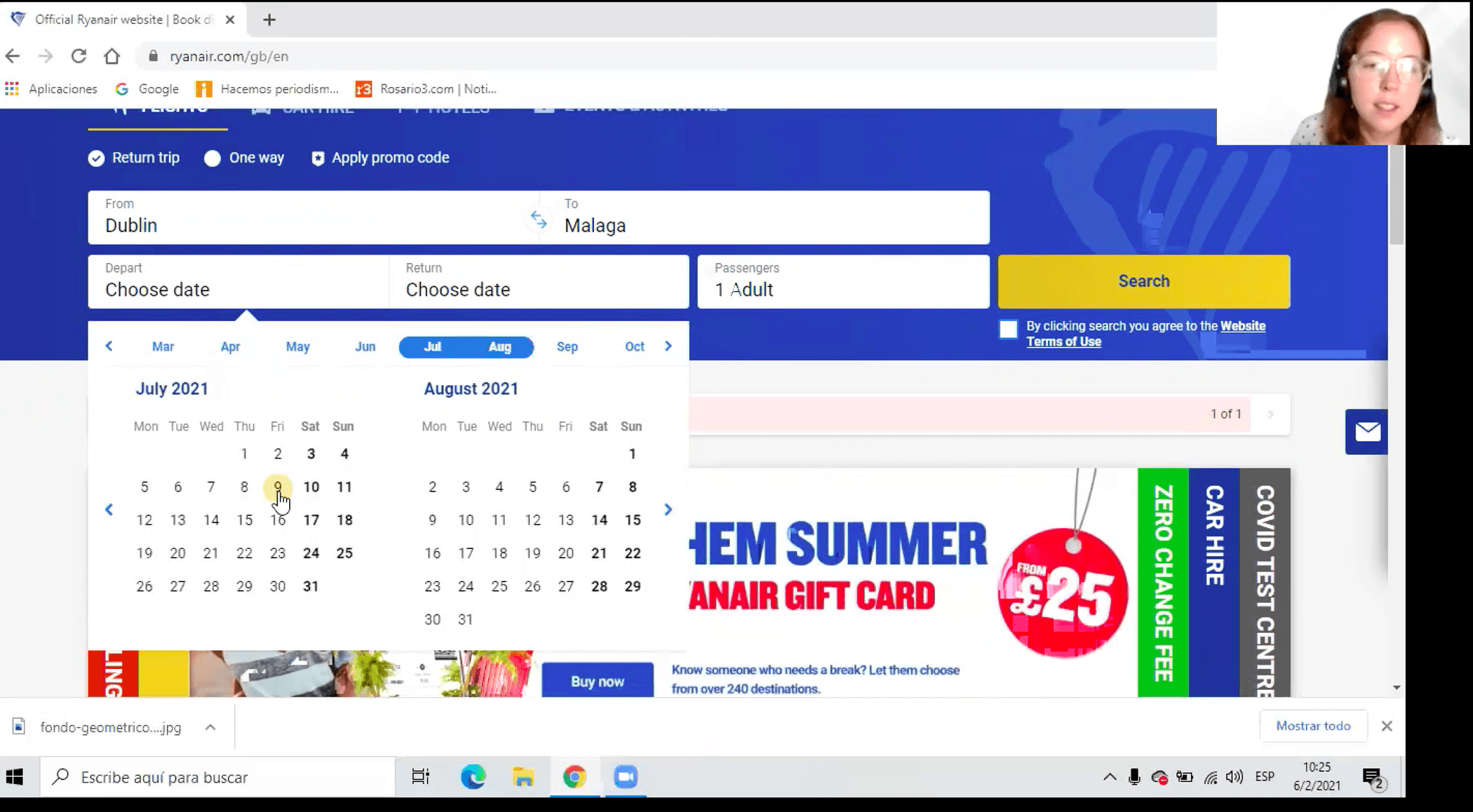
Screenshot of usability test - User A

Screenshot of usability test - User B
User A on flights results page
"I definitely think that the stopover should be between departure and arrival".
User B on fares selection
"Clicking for fare information takes time".
User A on user data entry
"I think this is misleading.. it's not highlighted.. I think they make it on purpose for people to register. I prefer to continue unregistered".
User B on fares information
"When you are booking you don't want to keep clicking here and there".
Analysing the findings
The next step in the process was to analyse all the raw data gathered in the previous stage in order to make sense of it and truly understand the problems to be solved. During my study, I used two methods: Affinity Diagram and Customer Journey Map.
AFFINITY DIAGRAM
From messy to structured data
After gathering data, I used an affinity diagram to organize and understand the information. I set up a remote Miro session with three participants to process the material. We created concise annotations on each stage of the user booking experience by examining notes from benchmarking and usability tests. Sorting the data by common themes revealed four key clusters:
Users' pain points
Simple and useful visual clues
Features that ensured a smooth flow
Users' intentions to evaluate behaviors

How the mess started

Evolution
*See the complete diagram here
CUSTOMER JOURNEY MAP
Understanding the narrative
Building on the Affinity Diagram, I created a Customer Journey map detailing the user experience of planning and booking a flight. Using Figma, I documented goals, behaviors, positive reactions, pain points, and mental models at each step. This clarified problem areas and helped focus on designing effective solutions.

Problem statement
Thanks to the insights from the affinity diagram and the customer journey map, I was able to frame the problem in the following statement:
“How might we create a fast, simple and intuitive experience for a flight booking process?”

Building the solution
With a thorough understanding of the problem, it was time to begin developing solutions to solve these issues. I used two methods to build those solutions: Flow Diagram and Interaction Sketches.
*See the complete customer journey map here
FLOW DIAGRAM
Crafting the ideal scenario
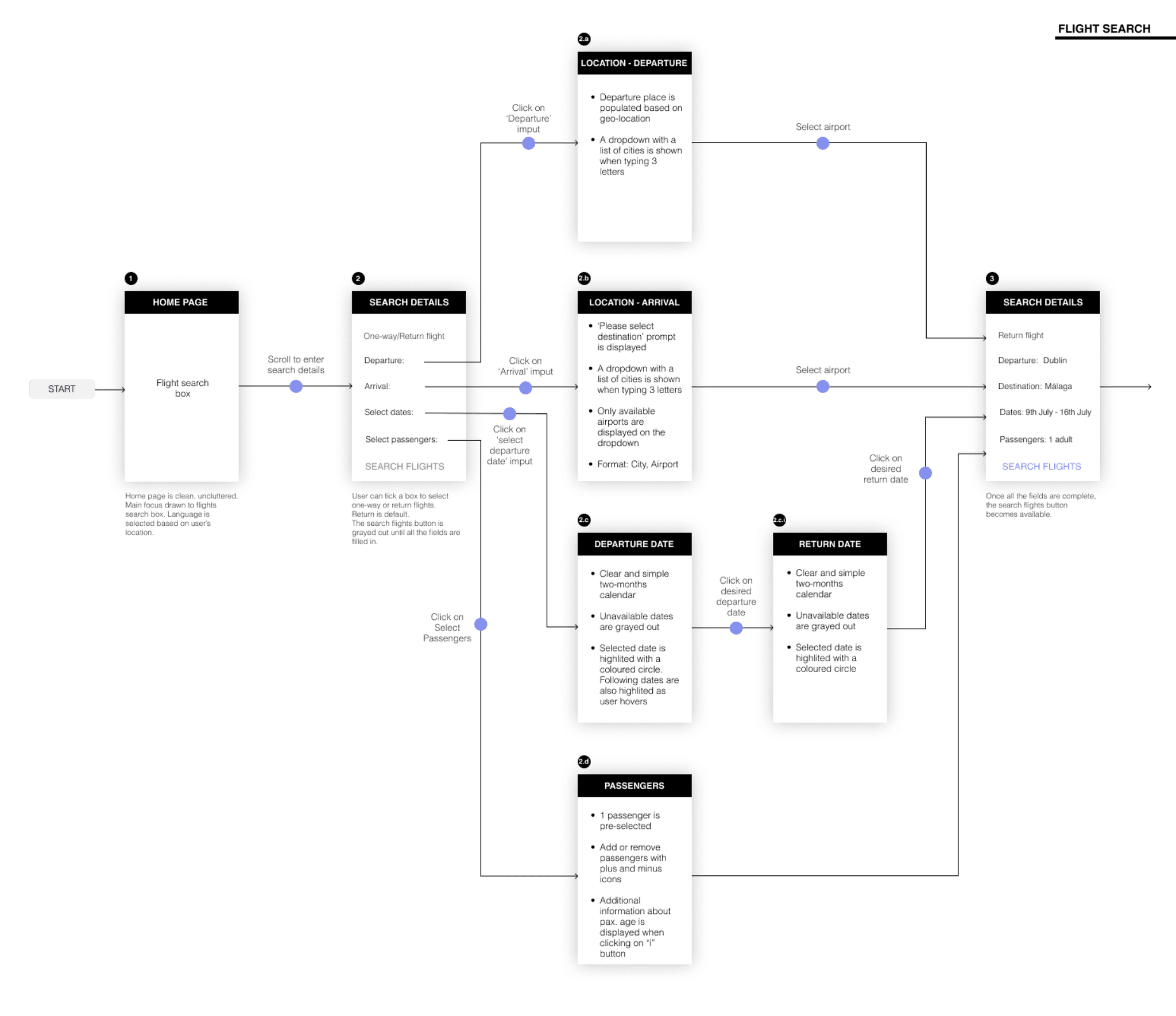
I visualized user movements by mapping each screen of the booking process, focusing on high-level user flows for searching, selecting flights, and making payments. After iterating on paper, I digitized the flow in Figma.
Key solutions included:
Clear, concise screens for selecting origin/destination airports, travel dates, and number of travelers to minimize steps before viewing flight results.
A progress bar to show the user's current step and remaining steps.
Simple, uncluttered screens with a consistent UI to keep users focused and prevent confusion.
A one-click toggle for different flight dates and prices to save time.
INTERACTION SKETCHES
Every story starts with pen and paper
Sketching helped visualize the screens and features identified from user research. I started with high-level navigation sketches, then refined the best ideas and detailed the full screens and interactions for the core flow.


💡
Before digitizing, I ran a usability test with the sketches. Despite initial awkwardness, users provided valuable insights by pointing out where they'd click, allowing me to iterate the design effectively.
MID-FIDELITY PROTOTYPE
Bringing sketches to life!
With every screen sketched out in detail, I could now bring them to life using Adobe XD. By including the necessary interactions, I was able to get a comprehensive perspective of how the final product could look like.
*Test the prototype here
USABILITY TESTING
Testing out the blueprint
After developing the prototype, I conducted two remote user testing sessions via Zoom. Users identified pain points and areas of confusion I hadn't noticed. This feedback was crucial for validating or disproving my design decisions.
Both users easily navigated the website due to its clean design:
User A
"The fare information is very clear. I know exactly what I'll pay."
User B
"The website is direct. I always know the next step."
The testing also pointed out other areas for improvement. Below, there are a few examples where I could translate their suggestions on my design:
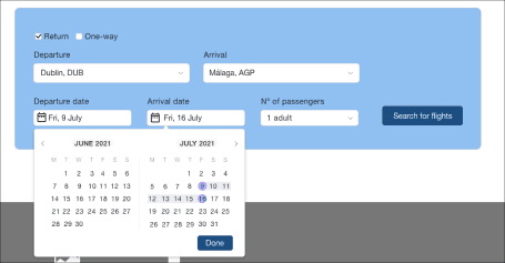
After testing with users, I realized I needed to place the "done" button to confirm the selected dates. This made the flow smoother, allowing the user to continue with the next task in a faster way.
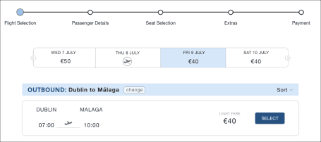
I altered the hierarchy of the elements to highlight the selection for outbound flight.
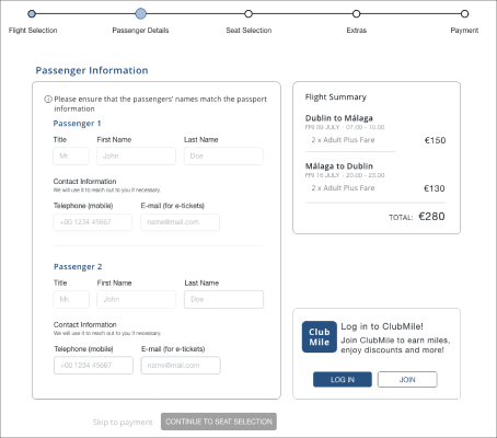
I placed the fidelity box lower in the page to give priority to the passenger information input. This change allowed the user to focus their attention on the primary goal.
DEVELOPER HANDOVER
Instructions to launch
The final step was to create a detailed document for developers. Using Figma, I specified the function and form of every element and interaction in the prototype, ensuring the wireframes contained all necessary details for accurate application development.
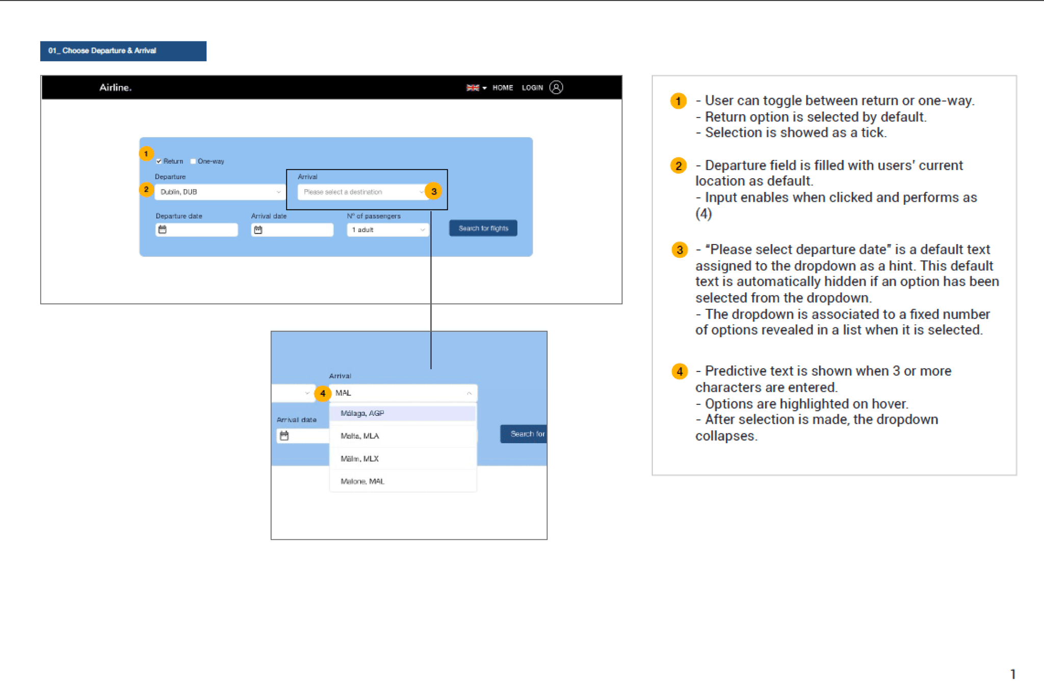

*See the complete document here
Conclusion and next steps
This case study allowed me to apply my UX Design Institute training, and I'm thrilled with the outcome. I enjoyed the real-life experience of usability testing and transforming user frustrations into a calm, intuitive product. Bringing a product to life from start to finish tested my skills, and I look forward to the next challenge.
I'm eager to explore more use cases for flight booking and conduct further usability testing to refine the design. In the future, I hope to work with a diverse team to create even richer products.